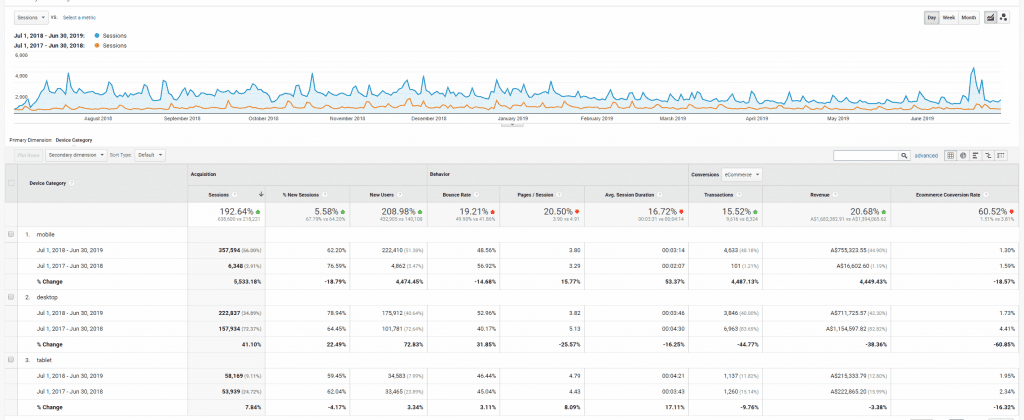
Focus on mobile increases revenue by 4,449%.
Smart phones have been around for a long time now, but did you know that more people access the web on their mobiles than on desktop or laptop computers? It’s true for most websites, so take a look at your Google Analytics for your own website. It may surprise you.
We often get approached by prospective new clients looking for clever digital marketing strategies. A lot of these businesses haven’t got their mobile website up to scratch, so that is often the first ‘clever digital marketing strategy’ we recommend
This PrestaShop retailer took our advice and changed their website to be more mobile-focused. The investment paid off. Their Mobile traffic went from 3% in 2018 to 56% in 2019, and revenue coming from users on mobile devices increased a dramatic 4,449%!
Always start by giving your users what they want which is a good experience on your website. And that’s often a mobile experience!
(You can scroll down to view a Google Analytics report for this client.)