Improving User Experience (UX) increases eCommerce conversion rate by 81%
When reviewing Google Analytics and looking for ways to improve eCommerce conversion rates, it pays to look at how users interact with your website on different desktop, tablet and mobile devices. When you look at Analytics data and see the numbers of visitors on mobile devices, it may surprise you.
Most businesses need to develop customer-centric strategies to ensure seamless and personalised experiences regardless of how, when, or where a customer interacts with the business. This means becoming ‘omnidevice’ and ‘omnichannel’ to provide customers on any type of device with a seamless and integrated experience across the company’s website, mobile app, physical stores, social media channels, email, and phone support.
A good place to start is with research and planning to discover and verify exactly what your typical or ideal users want to do on your website, whether on mobile, tablet or desktop devices – or a combination of different devices.
This Australian PrestaShop client trusted our advice, and invested in a new highly responsive theme for their website. This helped provide people on mobile devices with excellent user experiences, and the site worked brilliantly for desktop users too.
We implemented the new theme and made other design, content and process improvements to improve the User Experience (UX). We made the user experiences more engaging, and made the website processes faster, simpler and more convenient for users.
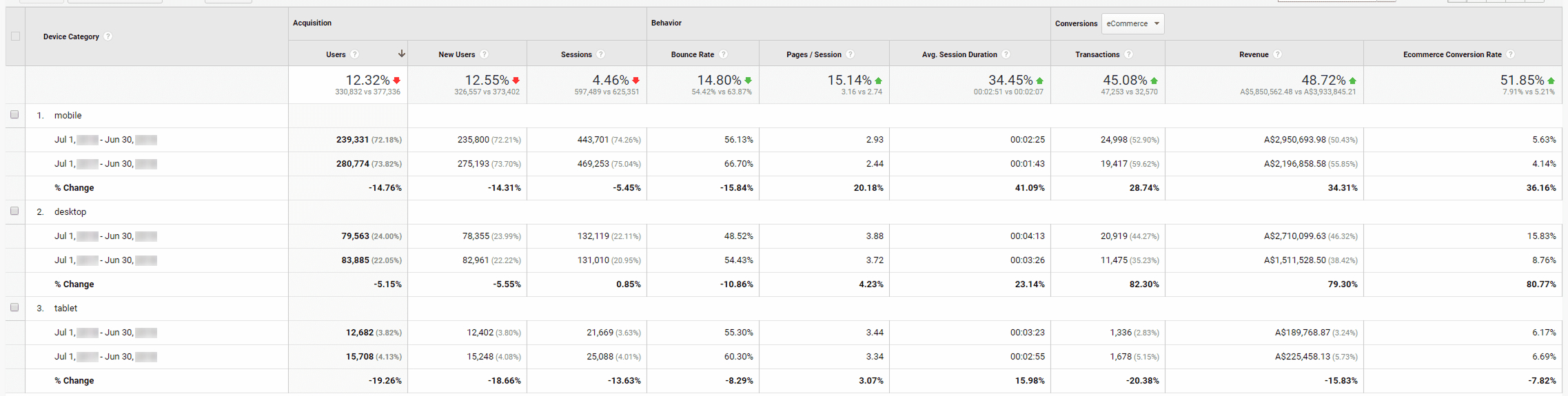
The result? As you can see from the Analytics report below, engagement improved and sales improved dramatically. Conversions increased by 36% for mobile visitors, AND a massive 81% increase for conversions on desktop!
With the right improvements, you can quickly make your website better for your website visitors, your customers AND for your business!
(You can scroll down to view a Google Analytics report for this client.)
Ecommerce store
PrestaShop
Bounce Rates improved by 14.8%
Pages per Session improved by 15%
Average Session Duration increased by 34%
Transactions increased by 45%
Revenue increased by 48%
+36% increase in ecommerce conversion rate on mobiles
+81% increase in ecommerce conversion rate on desktops
If you want to improve your website UX, engagement and sales conversions, please get in touch.