
For most businesses, customer acquisition is a marketing cost that is necessary if you want new customers. More importantly, to ensure a return on investment, a business needs to retain the customers they have acquired, by reaching out to the customer base with information they see as relevant to them.
If you are investing in SEO, Google Ads or Social Media it’s critically important that you retain as many customers from your digital marketing channels as possible. Email Marketing is the best way to reach out to your existing customers. Email Marketing has good B2B and B2C conversion rates, to help any business improve customer retention and increase revenue.
It’s vitally important to design your email marketing templates to maximise the deliverability and to make sure the open rates are high. That’s just the beginning, you also need to make sure the reader performs the action you require so your email marketing efforts are not wasted on messaging that just doesn’t work.
Shorter chunks of concise information are easier for people to consume and process. By combining concise content with the right call to actions your eDMs will have a greater chance of producing a return on investment (ROI).
The information in the guide below will help you create a better understanding of how to build your email templates to be short and concise, with a focus on smarter, single focus messaging. Furthermore, make sure the template design is within the coding parameters, otherwise your template may not render properly on all devices.

Email marketing templates are built using HTML and CSS code to make them responsive and render on all email accounts across all devices. If you make the design too complex with graphics, text and images, your emails will not display properly.
Every email marketing platform has its own set of template coding languages. Each platform provides a template library with a range of themed templates or blank canvas templates you can build as your own to save and use.
Problems arise when you are adding images, columns or content blocks with images and text that go outside the coding boundaries the templates are designed for. This is easily done and it’s best to stay inside the limitations of the template, otherwise you will be spending many hours trying to overcome complex coding issues.
For example, if you upload an image it may only be a few pixels over the maximum dimension but it’s enough to push the image outside the template boundary. This may cause text and image blocks to render outside the template boundaries, cutting off text or parts of an image.
Due to the many different email accounts available on desktop, mobile and web apps, you will need to make sure the template you are using is designed correctly, so it renders properly on most popular email platforms.
Depending on the email marketing platform you are using, you may be able to test the template using the platforms testing features. If the platform you are using does not have a testing feature you can use Litmus Email Software.

Careful consideration needs to be taken into account for the entire email marketing campaign to make sure the open rates and click-through rates are as high as possible.
Good email template design involves high-quality images at the correct resolution. It’s essential to have persuasive content, including in the subject line and preview text. Furthermore, your body content needs to direct the reader to respond to the call to action. Make sure you have buttons and other text to ask the reader to take an action like go to a website, download a brochure or watch a video. Your business objectives will be the key to your content strategy and ultimately your call to action.
The subject line is the reason why your email gets opened. Research from Chadwick Martin Bailey shows 47% of people open an email based on the subject line content. The subject line will be your most important ‘Call to Action’. Your subject line needs to be as short as possible and persuade the reader to open the email, otherwise, your efforts are likely to be lost to the delete button.
Preview text is additional content that is important for extending and supporting the message next to the main subject line. Use the preview text to strengthen the subject line.


The heading is the first piece of content your reader will see after opening the email. The heading also needs to entice the reader to look at the images and then read the relevant body content.
When your reader views the template, the logic is for the viewer to read from the heading first and continue down the template to the footer. Your reader needs to find the content (text and images) interesting enough for them to keep reading from the heading and follow through to the footer. A content strategy needs to lead the reader from one enticing piece of content to the next, making sure your call to actions are positioned so the reader can easily take up your offer.
Images are a visual cue to inspire the reader to continue reading. Images need to be relevant to the topic you are writing about. The best practice is to use one large header image because too many images are distracting, and you need to keep your message focused on a single topic.
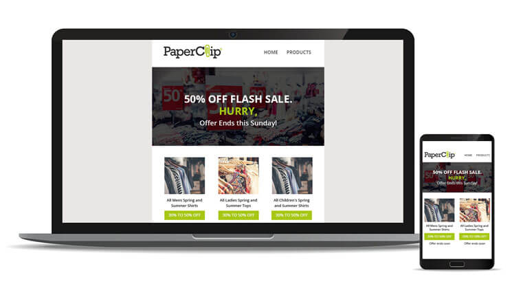
If you’re an eCommerce store then its fine to use a large banner image and smaller products images. At some stage, you may be using product blocks with multiple images. Make sure to test the templates and adjust the alignment of the text and images.

Following on from your main heading and banner image is your body content. Body content reinforces your message with an offer that the reader will perceive as valuable to them. Your call to actions will need to be positioned so the reader can easily respond to your offer.
The key to good body copy is to personalise your body content with the first name merge tag. The first name merge tag allows you to insert dynamic content like a customer’s first name into the template. This personalises the email and increases the open rate.
When you’re writing your body content, it’s best to keep the body content as succinct and short as possible. Try to say as much as you need to in a very concise, targeted message that leads the reader to the call to action. If you write too much content with mixed messaging your often time-poor reader will quickly lose interest.

Social media links are more than a simple link to your company Facebook page. Your social media can be used strategically to help bring more traffic back to your website. Create a small message, asking your customers to share your company, products or services with a friend.
You can ask your reader for a friendly show of support and write a review. Think strategically, before your final template is sent to your audience to maximise the opportunity to reach more customers with referrals and reviews.
Keep your email message short and targeted to your customer’s needs. Make sure the content has a good balance of headings and subheadings, allowing your reader to quickly scan the content for information that is of interest to them.
Don’t be concerned about high-end design unless you have the budget to custom code each template. The standard templates in the email marketing template libraries have been coded to be responsive on all email accounts and devices.
Adding complex graphics and images outside the coding parameters of the templates will break the responsiveness of the email. To avoid developer coding costs, make sure your template design does not over complicate your single message and stay laser-focused on a single business objective.
You can easily follow this simple Do’s checklist for your templates:
Below are some design techniques that you need to avoid.
Before you make any decisions, think about other services you may need for effective email marketing. For example, have you considered:
Concise Digital, employ experts in all areas relating to email marketing, from template design to complex email drip marketing campaigns. Discover more about our email marketing services to see what you can achieve.